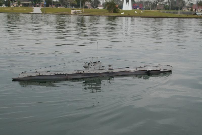
Is that you, Darrin? Love the weathering. And agree with your points. I would have hit the waterline on your S-class boat a bit harder, though. Mike will be very jealous when he sees this.
David
Bronco Type XXIII in 1/35th scale
Collapse
X
-
-
I am not against or for pre-shading. It all depends on your reference or what effect you are trying to achieve. There are so many different opinions about what you see, can see, or duplicate in a scale model, that I go for what I like or works. Even if that means the weld seam is a little too big or the rivet is 15% too large or the colors are not exactly right. As far as the stripe down the front under the rungs, I believe it was black or a very dark gray (grey - which is correct?) I have seen photos of other u-boats that have the same stripe under the rungs and some US also did that too!Leave a comment:
-
David, a "detail nut" I am, well to a point anyway but I personally don't prescribe to the pre-shade thing. Always seems a bit of a cheat to a paint job. Shading, wash & inks, some drybrush, chalk/pastels and blending work best for me when it comes to highlighting panels, lines, seams, nuts n bolts etc. What I do need to do though is successfully master your oil canning effect. :biggrin:Leave a comment:
-
Good stuff, Steve. The below waterline is indeed dark gray. Yes, I'll go with the yellow stripe. The dark vertical band under the ladder rungs is there to hide scuffing from boots, I bet it's black or dark gray not red.
Also, I read that in the later years of the war brass was so hard to come by that the propellers were cast from steel -- so, I'll polish up my white-metal propeller and oxidize it a bit then overcoat it with matt lacquer.
DavidLeave a comment:
-
Here is a photo showing a full suite of tower markings on a XXIII. This particular photo supports the "yellow" training band consensus. We know that the UAK (Unterseebootsabnahmekommando) markings were either white, black or red. The UAK mark (upper left quadrant) on this boat is clearly white. Thus, it looks like the horizontal and vertical stripes on the tower sides are indeed most likely YELLOW (like the experts claim they were). In addition, this boat has a dark stripe running vertical on the tower front. It is my opinion, that this darker stripe was RED.
This is another commissioning photo, taken in December 1944. The men up on the bridge are wearing their midnight-blue, peaked visor caps and dress coats both commonly seen in commissioning photos.
In addition, one can see "Die H�lle Glocke" (The Hell Bell) mounted in the tower.Leave a comment:
-
The boat is looking good! My only nit picks are the following:
Below the waterline should be dark gray (Dunkelgrau) instead of black. Or a medium gray if you're depicting a boat that has been out in the elements for a long time and its paint has faded. There should not be a black boot-line between the two grays (unless someone can produce a wartime photograph showing otherwise). The training bands / stripes around the sail are said to be YELLOW, not white (at least that is what all the so-called U-Boat experts have concluded). All the model companies put white stripes on their box art and painting instructions, especially of the Type XXIII. They also seem to commonly add a black boot-line.
The color yellow, when photographed, in black-and-white, does indeed look very much like white. When looking at black-and-white photographs of U-Boats sporting training bands, they do appear like they could be white.. It would be nice to see an original, war-time, color photograph of any U-Boat wearing light-colored training stripes, to see if they were indeed yelllow or white. Some of these training bands are dark gray in appearance (in black-and-white photos) and I personally believe that those dark gray looking bands were RED. Some boats could have a mixture of both yellow and red stripes / bands.
SteveLeave a comment:
-
Better get hot Manfred, the finish-line is in sight.
Tom, I hate counter-shading -- a practice so much in vogue with the airplane kit-assemblers. No, I block things out that have high and low relieve and otherwise would not get paint during the heavy lay-down strokes -- that's what your seeing in the photos. Just before the heavy spray passes of 'color'. (Guys like you and Alec, who are IPMS types, are detail nuts, so I know what you're thinking). I have yet to see a prototype plane or tank sitting there with discolored panel, access plate seams, and control surface breaks highlighted with a uniform run of discolor. Leaking oil, paint-chipping, dirt from fingers, yes. Counter-shaded breaks in the structure no! Today it seems you can't place at an IPMS contest unless you pick out the panels with an air-brush or wash.
I'm freezing the Type-23 paint job at this point so I can get it ready for the maiden patrol this Saturday at Nauticus. After that I'll dry-dock it for the boot-topping, white bands around the sail, and some heavy duty weathering. Stand by!
All in all, the Bronco 1/35 Type-23 model kit is a fun assembly task. Well engineered, tight fit, thick plastic where it has to be thick, and thin where it should be thin. Highly recommended.
This one's for Mike, the show-pony (assembled and painted for the Caswell-Merriman instruction article) model will be mine.
DavidLeave a comment:
-
David, I see you painted the seams and weld lines first, was this for coverage or weathering effect that the last pictures do not show?
Otherwise please, keep it coming. I may need to arrange my build list to bump this model up.Leave a comment:


Leave a comment: